Newsletters- 4 tips to get started

newsletter

When I started to design newsletters around a year ago, I knew practically nothing about this topic. Newsletters were these things which I would receive in my inbox, right? Next to my coworkers, who did App design or re-thought the concept of our website I didn’t seem to have an important position.

Since I had never worked with code before and wanted to get an easy entrance into the topic, I was still satisfied. To my surprise I learned that newsletters are not that boring and unchallenging, rather the contrary was true.

It is possible to make absolutely beautiful things if you have love to detail and the patience to make new design concepts work in every email client.

For starters I only want to talk about 4 tips, which I see as a basis before digging deeper into the actual design.

Don’t use nothing but images images

It seems like the simplest solution – you don’t have to worry about fonts and tables and all that mad stuff, but effectively it’s not. One problem is that by making your newsletters nothing but (or an overwhelming amount) pictures, it is more likely to receive a higher spam rating. Once you are in that category it is quite hard to get out, meaning a huge junk of your audience won’t be reached anymore.

Another problem is, that some clients will not display images by default and the user has to manually allow showing them. If your email is purely image based, the user will not receive any information about it’s content and is much more likely to just hit delete without reading it.

newsletter-images-disabled

Image alt text

When you do use images give them a description with the alt-tag. This text will be displayed if the picture cannot be shown or is deactivated and gives the user information what he would see there. It is also important for disabled (for example blind) readers, as the alt-description will be treated as text and read to them out loud through a machine.

An example for an alt tag would be:

<img src=„blog-image.jpg” alt=„Newsletter – 4 tips to get started“>

Of course it’s best to make the alt-text relevant to what is shown in the image.

Text size
Choose a text size which makes it easily readable for people. (So no size 10px in light grey, please!)

Mentioned in the Litmus conference was that for copy text standard size is around 14px, but that also depends on what kind of font you are using.

It is easier to navigate through an email if you use a clear hierarchy, which means the same size for headlines, sub-headlines, copy text and footnotes.

For example H1 (headlines) are always 24px, H2 (subheadlines) always 18px or 16px, copy text 14px and footnotes 12px.

Subject line and Pre-header
I believe you all know what a subject line is, but just in case: It’s like an introduction to your email and appears behind the email name.

The pre-header is the summary text, that follows right after the subject line. If you don’t define it, whatever you wrote as the first sentence in the email will be displayed. But why not take the opportunity to control what’ll be displayed?

It’s a great chance to give the user information about the contents and make him interested in opening your newsletter.

At this point, I want to stress just one thing: Regardless of what you see on other infographics or posts, using deceiving copy will not give you the results you want!

Don’t pretend that the other person „just won an iPad“ or will see „great kitten images“, when you want to sell him a product about plant medicine.
Sure, your open-rate might be great – for once!
Once the person discovers the lie, you will most likely be handled as spam and never appear in their inbox again.

Also, very often email clients automatically read these lines and automatically mark you as spam on their own.

I think, the better option is to just be honest and give a useful first line about the contents of your email.

But how do you write the pre-header?

This is an example from one of my newsletters:

<!–preheader text–>

<p class=”preheader” style=”Margin: 0; color: #f4f4f4; display: none; font-family: Noto Sans, Tahoma, Verdana, sans-serif; font-size: 1px; font-weight: normal; line-height: 1px; margin: 0; padding: 0; text-align: left;”>Are you in Rio for the Olympics? You should visit this breathtaking places</p>

<!–preheader text end–>

As you can see, we put the text in the smallest font-size, so it’s not visible in the email itself. Of course you are free to style it however you like.

So that’s it.
I hope these 4 tips were a useful start .

See you next time!

Litmus Email Conference Recap

lit4

You know these days, when everything just seems to go wrong? That seemed to be the case, when I was on the way to London for the Litmus Email Conference 2016.

I already went to work with a bad feeling, which I didn’t seem to be able to shake off, no matter what I tried. Making a few jokes with my coworkers I told them good-bye and made my way to the bus for the airport.

Thanks to my previous bad feeling, I wasn’t all too surprised, when my bus broke down in the middle of the street leaking oil. Making a quick decision, I teamed up with 3 other people and we took a taxi and to my surprise, the one girl in there even covered costs for me! Thank you so much!

I thought, I had gotten rid of any troubles, the procedure through the security gate went quickly without any disturbances, but it turned out, my flight was to be delayed for half an hour. Then a full hour. Two hours. More.

When I finally started to get impatient, due to the check-in closing times of the hostel, where I would stay, we got into the plane, where we still had to wait at least half an hour to finally get up in the air. To not waste any time, I took a taxi to the hostel and made it right in time for check-in shortly before 11 at night.

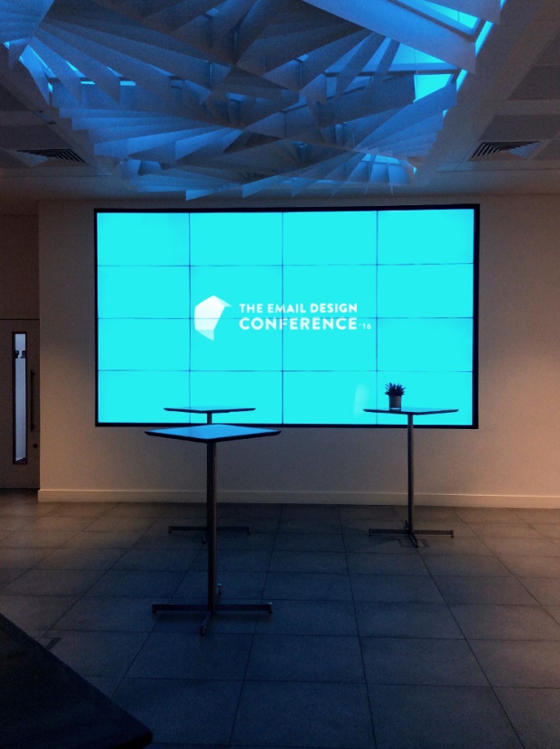
lit1.jpg

The location was very easy to find the next morning, since I had already been close there during a holiday weekend with my friend in May. (Funny enough, it is close to where the Jack the Ripper murders happened. And also close to a cat cafe.)

I told the ladies from the conference my name, only to find out, that my name nor my company’s name was on the list! Using their wifi, I quickly contacted my manager. Having the probably best manager in the world, she took care of the problem and bought me a last minute spot. Thanks to her I could still make it!

But hold on, Misaki, what even is the Litmus Email conference?

Litmus itself is a company which provides a helpful platform for email testing, creating, helping with analytical tools and more. We use it to give our email code a first check up, how it behaves in different clients like Gmail or Yahoo Mail, before we live test it.

Once a year, Litmus hosts a two-day workshop conference in different cities like London, Boston and San Francisco this year, to bring the email community together, so we can learn from each other or share our pain with said clients. (Looking at you, Outlook!)

At the entrance we got little goodie-bags including business cards stating useful coding tips, buttons, a shirt and stickers and then headed to the workshop room for The Elements of Email Design. (There was another workshop about Progressive Enhancement and Interactive Emails.)

lit2

Teaching a range from very inexperienced attendees to full-fledged newsletter designers, the workshop covered pretty much all the basics for designing a good, standard email and I felt proud, that my team already covered 95% of the presented things.

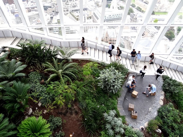
After that followed some very interesting talks like addressing how to take leadership over your design and rules to be morally correct when targeting subscribers. To round up the first day, a few people could submit their email code to get live feedback from the Litmus hosts and the audience about how to improve it.

ll3.jpg
ll4
ll7.jpg

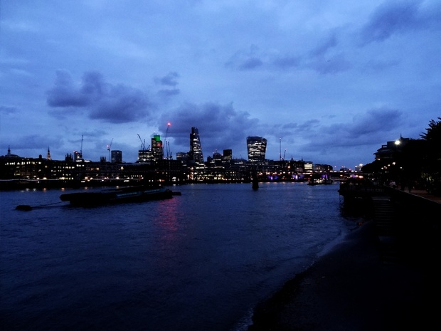
The first day ended around 5, I think, which left me with an evening to walk around London a little bit. Since my hostel is located close to Tower Bridge I made my way from there along the River Thames to Big Ben and back. If you are ever in London, try to do this walk as well, especially when the sun begins to set!

Not only are Big Ben and the London Eye beautifully illuminated at night, the trees along the path are decorated in fairy lights, every now and then a talented street musician showcases their skills (I witnessed a girl with an incredible rough, emotional voice and a guy stating he’s a lost wanderer and playing melancholic guitar tunes) and once it gets quieter you can hear the soft crashing of the waves against the tiny strip of beach along the water. It’s super romantic haha!

ll14.jpg
ll10.jpg
ll11

The second day started with a nice breakfast in my hostel, after which I made my way back to the conference building. Unlike the first day, this time talks were divided between Marketing and Development, so you could choose which one to attend. A bit of a tough choice, since they all sounded so interesting, but thankfully each session got recorded, so we could watch them later.

My flight back to Dublin already went off in the afternoon, so I had to skip the last lecture and the farewell speech, but looking into the Twitter hashtag, everyone seemed to have had a blast.

All in all, I absolutely loved the event, from the little surprise gifts (Litmus socks anyone?!), the amazing food (Bento boxes for lunch and the tiniest ice-cream cone ever as dessert!) to the fun people (joking about dubious red light tinted hotel rooms with two Copenhageners).

If you are interested in learning more about Email Marketing and meeting like minded folks, this is your go-to conference!

Creative Days

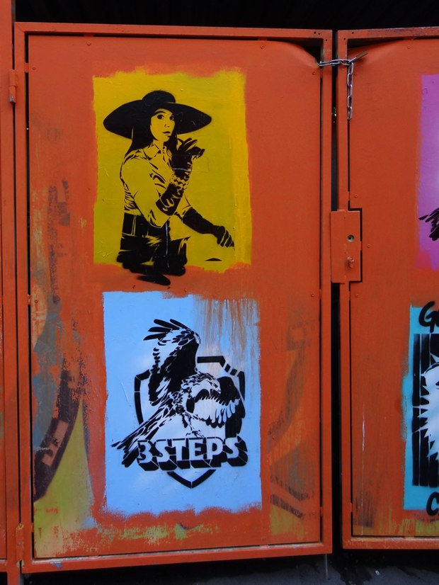
graffiti1Currently I am working for an agency near Munich East. When I am walking there from the station I am surrounded by countless graffities in all variations. The creativity these artists put into their pictures is truly astonishing! So much love to detail and abstractation.
graffiti2graffiti3While I think simply scribbles of names (like on the right side of the picture) are a violation of a building or property, I love looking at graffities where artists put a lot of thought or personal meaning behind it.
delicious waffleWhen I met up with a friend at the Central Station last week, there were no way around the new waffle-to-go shop, that had opened a few months ago! If you’re near there, check it out, it’s sooo delicious. They have a small selection of choices, such as waffles with banana, ice-cream, cream and chocolate topping, strawberries, chopped almonds,…
It’s not even that expensive and when you’ve collected enough stamps after a few visits, you get a waffle for free, yay!
nail designAfter almost 4 weeks I also had to renew my fingernails. This time I chose a full cover in glitterish red, with a gold line and a white flower. I think this design fits my personalty the best out of all the designs I had so far.
I never did a fullcover before, simply because the grow-out is a lot easier to notice. But after collecting way too many shades of nailpolish, I think I have a color that fits this shade really well.
radical self love bibleOkay, and here’s some pictures of my current personal project: My Radical Self Love Bible.
I am following Gala Darling for a little more about a year now and her positivity and sparkling is something which inspires me on a nearly daily base. She adds to the things, that helps me to pull myself together, trying new things and growing as a being.

Nevertheless, I can be quite a cheapskate, so I didn’t bother buying her RSLB School Course until she had a Summer Sale.
Although I am a graphic-designer, I’m not super-crafty with things, well, but since it’s just for myself – no hard feelings! Just doing what feels right.

And it’s soooo much fun! 
At first I had to overcome my inhibition of cutting magazines. Since they had cost me money at some time in my life and I didn’t want to waste the beautiful pictures on the pages for something, that would look stupid in the end, I never did collages or the likes in my life. (Aside from school projects.)
After braving myself enough to do this, I couldn’t stop tearing pages, snipping and glueing them together, haha.

Then, I followed the step by step instructions of what to write about. Soon I even got my own inspiration, what topics I’d like to add, such as the Guilty Pleasure page shown above. (Which is currently my favorite page design-wise.)

Radical Self Love Bible is a long, long, probably neverending process of discovering oneself, so I am looking forward how my pages will evolve and what things I will learn.

Are you crafty?
What kind of things do you create to express yourself?
Please tell me in the comments!

For that, goodbye!
See you next time again!

My Cup O’ Tea

flickr-substituteWhen it comes to tea, it is the same for me as coffee is for 90% of the business population. Even in summertime I like to start my days at work with a nice cup of Earl Grey with sugar and milk. Most times I prepare a carafe for the rest of the day, letting it cool down to drink as a juice substitute. I think, fruit tea is especially good for that.
(Unfortunately I couldn’t find a “real” summertea, which you can make with cold water, yet. The ones I tried tasted too bitter and chemical.)

My passion for tea didn’t rose with my travels to Japan, as some people think, but because I fancy this as an old british lifestyle.
From time to time I imagine myself to someday sit on my own balcony, drinking loose, freshly brewed tea from small cups painted with Victorian roses. (Oh, so romantic…!)

While I have a thing for this kind of kitsch, I also fall for more plain but stylish designs with gold elements, such as these:
cups0808141. Winter Landscape Mug 2. Ceramic Mug 3. Reiko Kaneko Lip Tease Mug 4. Mikasa Confetti 14-Ounce Mug 5. DIY Cup from the winthrop chronicles 6. MOBIUS cup 7. Flawed Gold-Plated Cup 8. Luxe Mug

See you next time again!

Intro picture: helloimwild